Day 9 - Thinking in Frameworks
Today, let’s think about why frameworks exist and how thinking systematically makes things easier.
When you’re building your first website, it’s tempting to make design decisions on the fly. But before you know it, you can’t remember which colors you used where. You will soon realize that you’ll need your own ‘guides’ and a way to keep them handy. This is where planning systematically helps; making key decisions once so you don’t have to keep remaking them.
A personal design system
Whether you’re building with plain HTML and CSS or using a framework like Astro, you’ll face the same design choices. Imagine spending 20 minutes choosing the blue for your links. Later, you need that same blue for a button but can’t remember the exact color code. Now you’re either hunting through your CSS or settling for “close enough.” A simple system will prevent this. It also makes your site feel more “intentional” because everything feels cohesive and connected.
You’ll also spend less time on repetitive, boring decisions and more time on the interesting parts of building your website.
Step 1: Plan Before You Code
Before jumping into HTML and CSS, spend 45-60 minutes planning your system visually:
In Figma, Canva, or even on paper:
- Create color swatches with their hex codes
- Show your typography at different sizes
- Sketch basic components (how do buttons, cards, and lists look?)
- Explore how your colors work together
I would recommend starting simple:
- Start with a simple mood board or color palette generator
- Pick colors that work well together (tools like Coolors can help). Pick 2-4 colors total to begin with.
- One or two primary colors for important elements (headings, links, buttons)
- One or two secondary colors for highlights or special elements (optional)
- Text colors: Maybe one dark, one lighter gray, one for something else.
- Choose at most two fonts that you really like
That’s it. Resist the urge to add more right off the bat, you can always add more “non-system” things if you need to. These are just colors or fonts that you will be reaching out for a lot. Exceptions and one-off usecases are always there.
Name them by purpose
Call them what they do. No hex codes or abstract names (no color-1, for example) in your head:
Colors →
--color-primary,--color-secondary,--color-bgFonts →
--font-normal,--font-large
Step 2: Plan Your Typography
Choose up to two font families and define 3-4 sizes that work well together. Most websites need:
- Large heading (for page titles)
- Medium heading (for sections)
- Normal text (for paragraphs)
- Small text (for captions, footnotes). This should be no smaller than 12px.
Test these sizes together to make sure they create a good visual hierarchy.
Example Moodboard
Once you’ve decided on everything, lay these details out in a tool of your choice (Figma, whatever). It can look something like this:
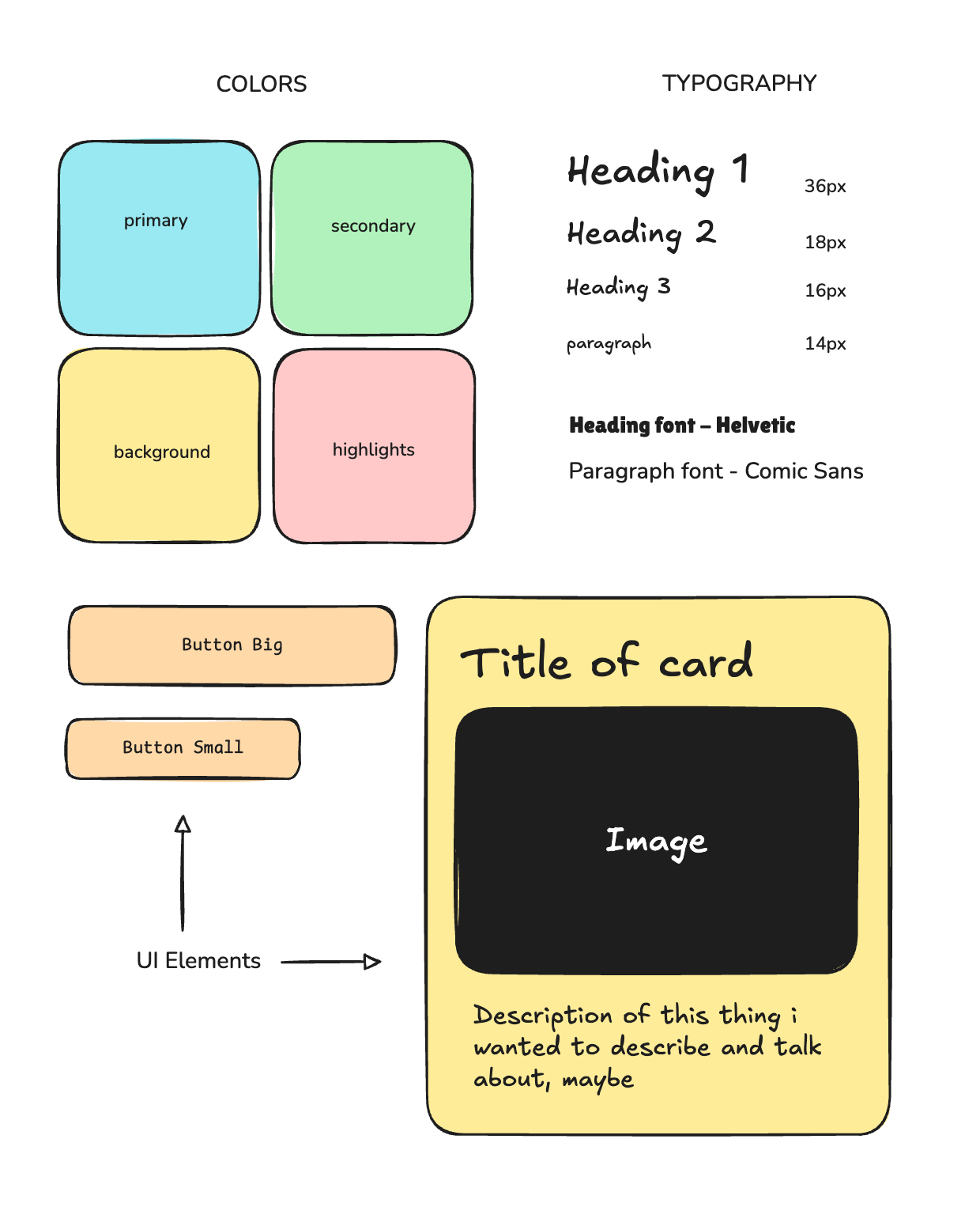
Essentially, the idea is to give yourself a reference for the repeated things you imagine using. For example, in the above example I have created a card ‘component’ and I know that when I start coding it, it should look like that. I don’t have to think about what the buttons are supposed to look like, what the cards are supposed to look like when I am building.
Do not go overboard here. It is alright if you leave some things out, this is for the things you know you will keep using.
Step 3: Implement with CSS Variables
This is for when you start coding. Come back to this when you’re done with your planning.
Now that you’ve planned everything out, implementing becomes straightforward. Instead of scattered color codes throughout your CSS, define your colors once at the top:
You might have written stuff like this before:
.button { background: #2563eb; }
.link { color: #1d4ed8; }
.nav-item { background: #3b82f6; }
/* confusing! */
CSS has a new superpower you can put to use called variables. They are names that you define which can be used in place of these hardcoded values.
For example, writing this in your CSS would mean that you have defined a color called --heading-color and are asking the browser to use that.
h1 {
	color: var(--heading-color)
}
A variable always needs to start with -- but you can name it whatever you want. --heading-color, --font-serif, --text-color are all valid names. Having done this, you can define these variables in the :root tag on top of your CSS file and use it like so:
:root {
  --color-primary: #2563eb;
  --color-secondary: #f59e0b;
  --text-dark: #1f2937;
}

.button {
  background: var(--color-primary);
}
.link {
  color: var(--color-primary);
}
.nav-item {
  background: var(--color-secondary);
}
Now all your primary elements use the exact same blue, and if you want to change it, you only edit one line (in the :root!)
Same thing with our typography added in:
:root {
  --color-primary: #2563eb;
  --color-secondary: #f59e0b;
  --text-dark: #1f2937;

   /* Adding typography too */
  --text-small: 14px;
  --text-normal: 16px;
  --text-large: 20px;
  --text-huge: 32px;
}

h1 { font-size: var(--text-huge); }
h2 { font-size: var(--text-large); }
p { font-size: var(--text-normal); }
.caption { font-size: var(--text-small); }
How Many Variables Should You Create?
Start small. 2-4 colors and 3-4 text sizes. Only create a variable if you use the same value in multiple places. Don’t make variables for one-off styles. If you find yourself copy-pasting the same color or size repeatedly, that’s when you add a new variable.
A complete example
Here’s what a basic :root setup might look like for your website:
:root {
  /* Colors */
  --color-primary: #2563eb;    /* Blue for links, buttons */
  --color-accent: #f59e0b;     /* Yellow for highlights */
  --text-dark: #1f2937;        /* Main text color */
  --text-light: #6b7280;       /* Secondary text */
  --background: #ffffff;       /* Page background */

  /* Typography */
  --text-small: 0.875rem;      /* 14px - captions */
  --text-normal: 1rem;         /* 16px - body text */
  --text-large: 1.5rem;        /* 24px - section headings */
  --text-huge: 2.5rem;         /* 40px - page title */

  /* Fonts */
  --font-main: 'Inter', sans-serif;
  --font-heading: 'Georgia', serif;
}

/* Now use them */
body {
  font-family: var(--font-main);
  font-size: var(--text-normal);
  color: var(--text-dark);
  background: var(--background);
}

h1 {
  font-family: var(--font-heading);
  font-size: var(--text-huge);
  color: var(--color-primary);
}

.button {
  font-family: var(--font-main);
  background: var(--color-primary);
  font-size: var(--text-normal);
}
Set-up for next week
From tomorrow (Friday, Aug 1) till the end of class you will be engaged in bringing your designs to life. This means taking steps to ensure that you remain on track and the things you prioritise are completed on time, so that you feel good about the output by the end of class.
One way to do this is to outline what your checkpoints and major tasks are for the job ahead. Looking at your high fidelity designs, you can break the project into smaller chunks such as:
- Make a menu
- Make the homepage top section
- Make the card components
- Make the about me section
- Make the two column word grid section
And so on. As you go through the next 13 days, you can either keep adding to these list of tasks or keep ticking them off (the dopamine hit is important!). One way to do this in a way I can see your progress and help guide you if needed is to create Github issues on your repo.
Head over to Github and create a new repository with the name web2025-YOURNAME-site. Once you create it, go to the Issues tab on the repository and click New to start adding issues to your repo.
Each issue is one task. It can be something as simple as:
Add menu

<!-- IMAGE OF MENU FROM YOUR DESIGN -->
To start with, you should have at least 10-12 issues. Remember that these are small units. An issue for Add About Page is not useful because the About page itself will have smaller things you want to tackle one at a time.
As you go along, you can keep checking these off and ‘Closing’ them, helping you maintain a roadmap to the end of the project.