March 31, 2025
Day 6: Visualizing Summaries
In today’s session, we dove into the practical aspects of creating effective visualizations using tools like Datawrapper and RawGraphs. We explored chart selection, design principles, and the importance of data summaries.
Choosing the Right Chart Type
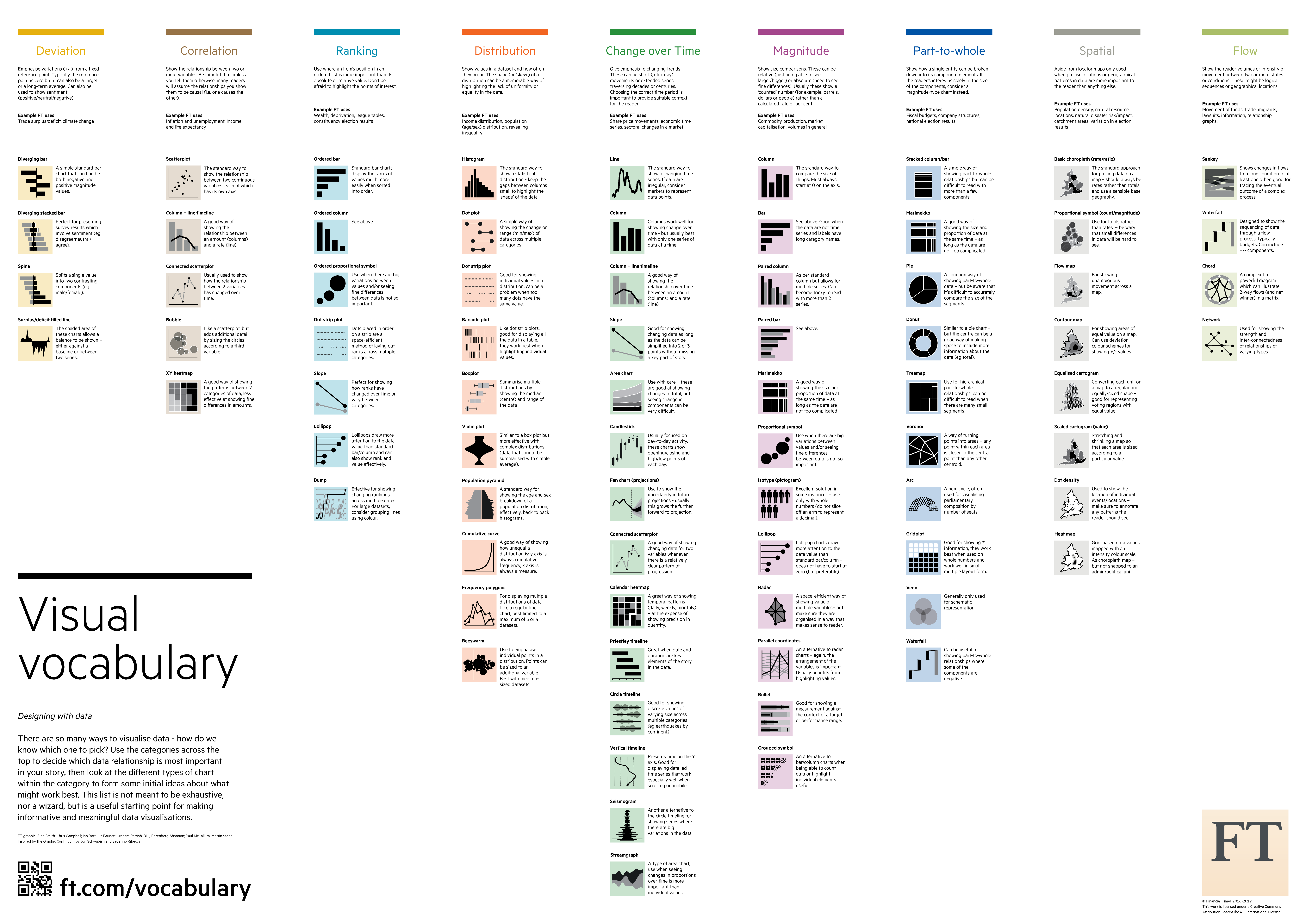
We learned to select visualization types based on their function:
- Correlation: Scatter plots, bubble charts (showing relationships between variables)
- Ranking: Bar charts, dot plots, lollipop charts (ordering values)
- Distribution: Histograms, density plots, box plots (showing data shapes and spread)
- Change over time: Line charts, area charts (temporal patterns)
- Magnitude: Bar charts, column charts (size comparisons)
- Part-to-whole: Pie charts, stacked bars, treemaps (composition visualization)
Checklists for Effective Visualization
- Data looks better naked - Remove unnecessary elements that don’t contribute to understanding
- Write better titles - Tell viewers what they’re looking at and why it matters
- Label directly on the graph when possible, avoiding legends that require extra mental effort
- Use color purposefully - More colors ≠ better visualization
- Minimize complexity - Your visualization is complete not when nothing more can be added, but when nothing more can be taken away
Data Summaries
We explored how to make large datasets more digestible through summaries:
- Aggregation: Grouping similar data (averages, bins, etc.)
- Projection: Reducing dimensions to focus on key aspects
- Subsampling: Taking representative portions of large datasets
- Filtering: Keeping only what meets specific criteria
A good summary can help visualize:
- Trends
- Outliers
- Clusters
- Frequency
- Distribution
- Correlation
Hands-On Activities
We practiced these concepts through:
- Redesigning an ESPN visualization on “toughest sports by skill” using Datawrapper
- Exploring time use data across different visualization approaches
- Creating summaries from the artists dataset in Orange and visualizing them in Datawrapper
Links mentioned
Important links mentioned in the slides:
- Financial Times’ Visual Vocabulary
- The Data Viz Project
- Data to Viz
- Artists dataset
- Data reshaping reference
- Pivotteer tool